BestSummerPrograms
An accessible database for high school students to navigate the precollege landscape. Product is still ongoing
Context
The platform was growing its summer program database and expanding into high school competitions as a new vertical.
Overview
I owned the scale-up initiative: redesigning the visual systems, and UX flows to support a larger database and user base across devices.
Case Study 1
Navigation Redesign
Problem
Users couldn’t easily access all of the databases
Previous UX flows were only designed for the single program database, and less metadata attributed to each entry, limiting access to all corners of the site.
Previous Design built just for programs (Not my work)
Design Goal
Bring visibility to new data
Create more entry points throughout the site to explore and learn seamlessly between programs, competitions, and their respective pages.
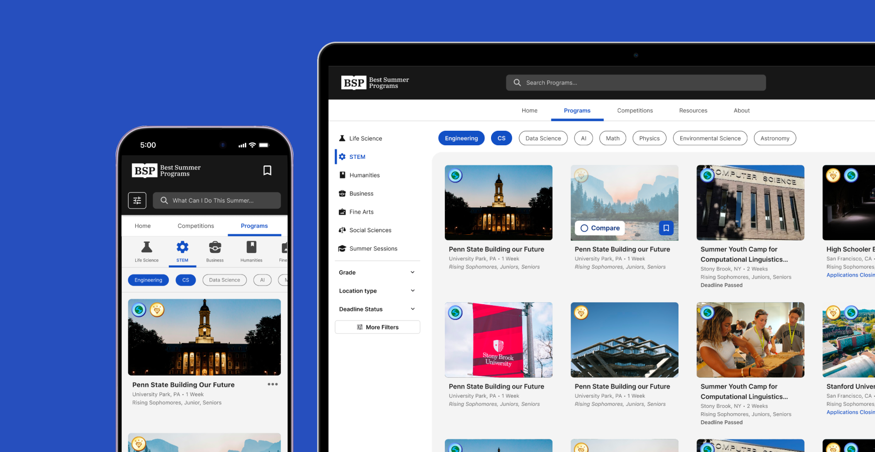
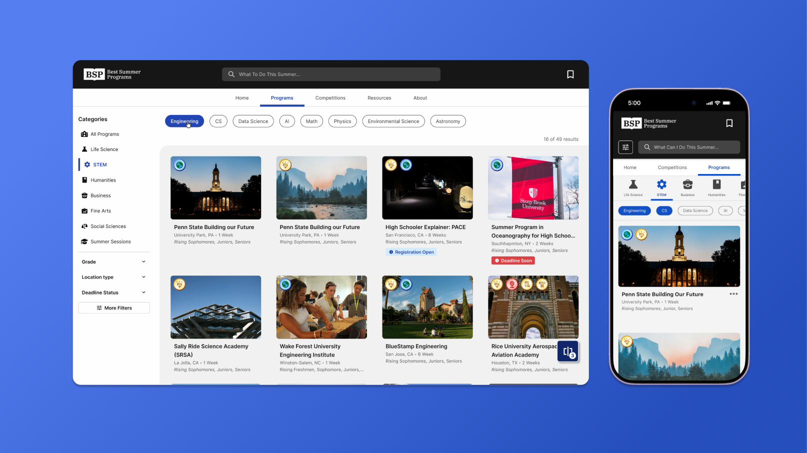
Desktop navigation usage (search hover, subject pick, category pick, more filters)
UI Layout
Restructured navigation hierarchy: search, tabs, filters
The layout aims to keep users aware of their selections and location throughout the browse experience.
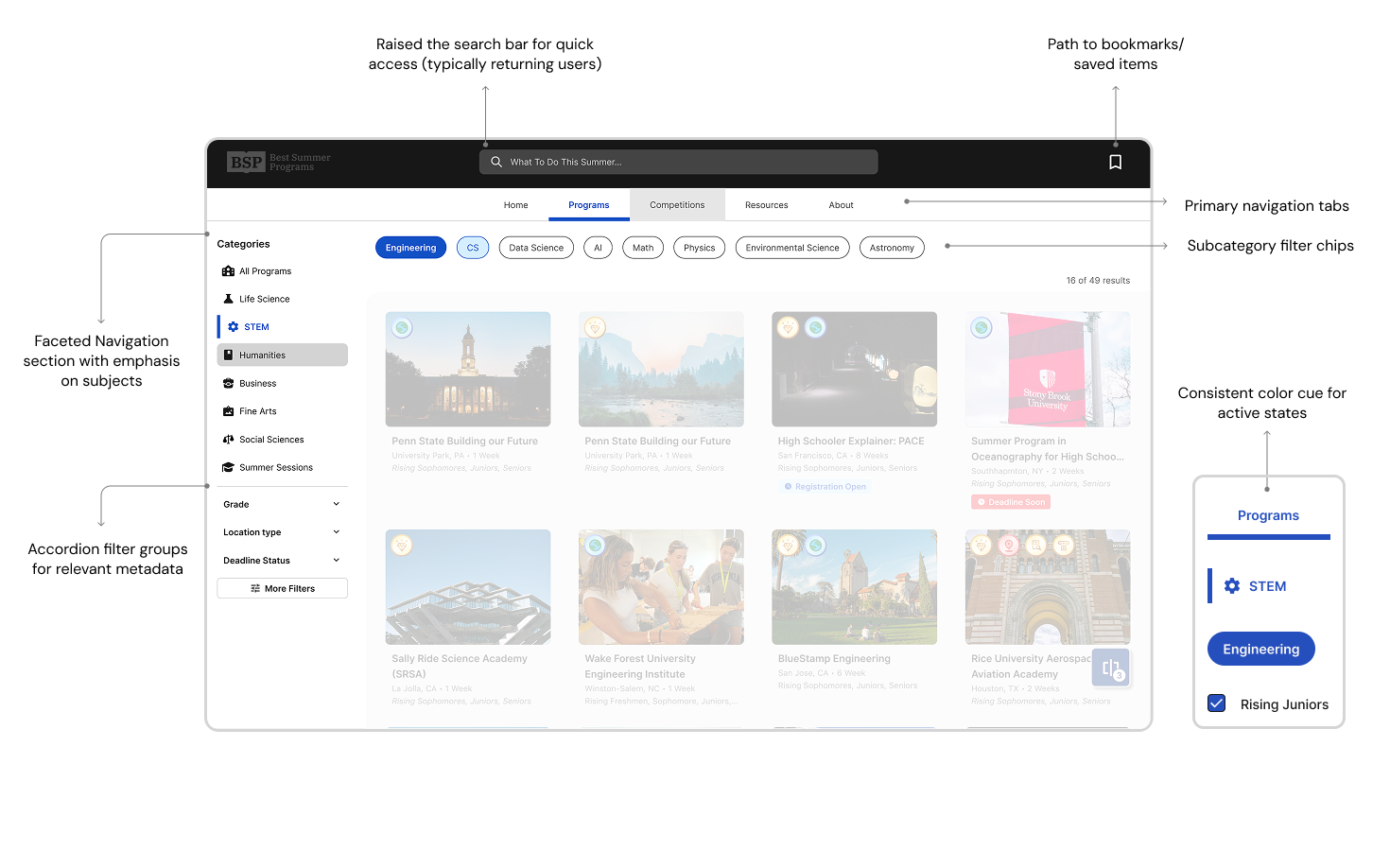
Desktop navigation usage (search hover, subject pick, category pick, more filters)
Filter Modal
Icon driven filters to for quick readability
Introduce icon association with metadata filters that will be used frequently throughout project and competition pages.
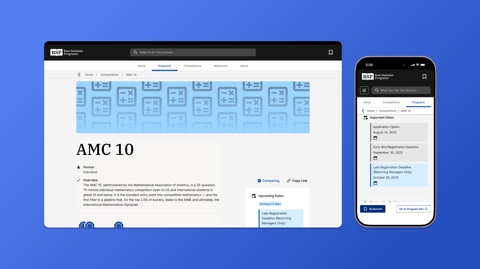
Mobile navigation usage (Menu expand, subject pick, category pick, more filters)
Mobile Compatability
Condense navigation for familiar mobile interactions
Mobile navigation usage (Menu expand, subject pick, category pick, more filters)
Filter modal
Case Study 2
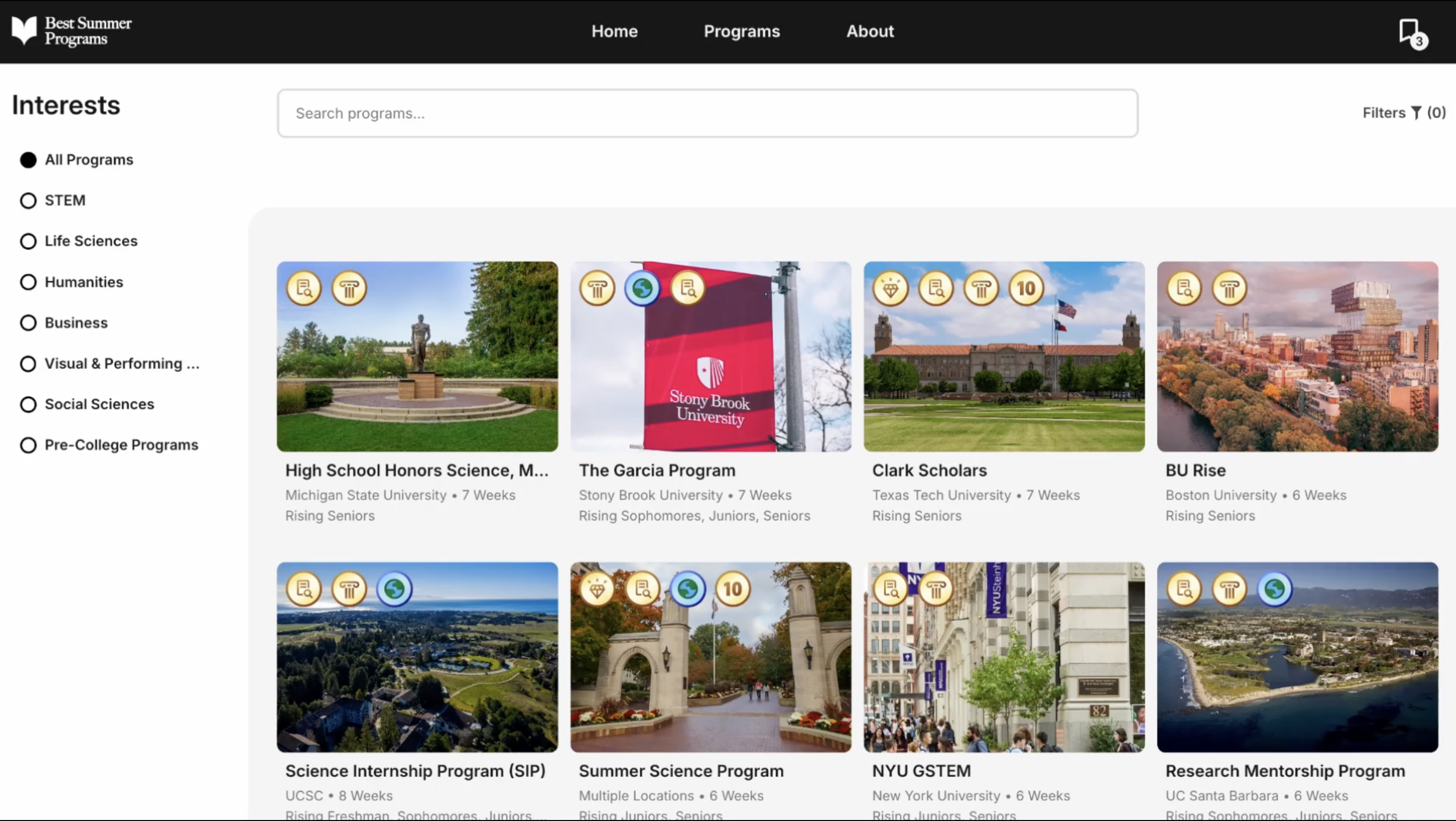
Competitions Pages
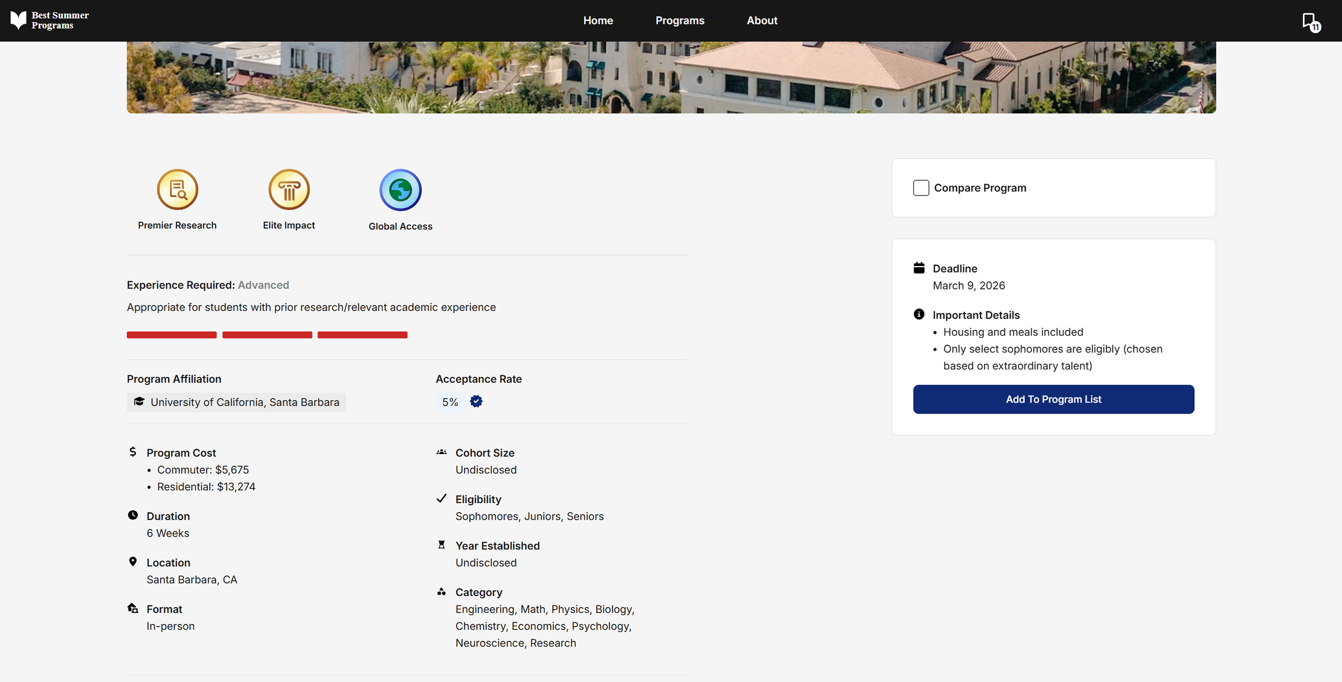
Problem
Data didn't fit a single format
Fields like deadlines and costs for programs often had multiple values or conditions for competitions — a single bullet point couldn't represent that range, creating inconsistent patterns across pages.
Previous project page layout (Not my design)
Design Goal
A clearer hierarchy for variable data
Redesigned page layouts to surface the most relevant information first, with new components built to handle variable data like tuition and deadlines.
Filter modal
Displaying Lists
Presenting deadlines and fees functionally
These lists are designed around the content type, showcasing deadlines chronologically and color-assigned based on urgency, and multiple fees in a way for quick calculations.
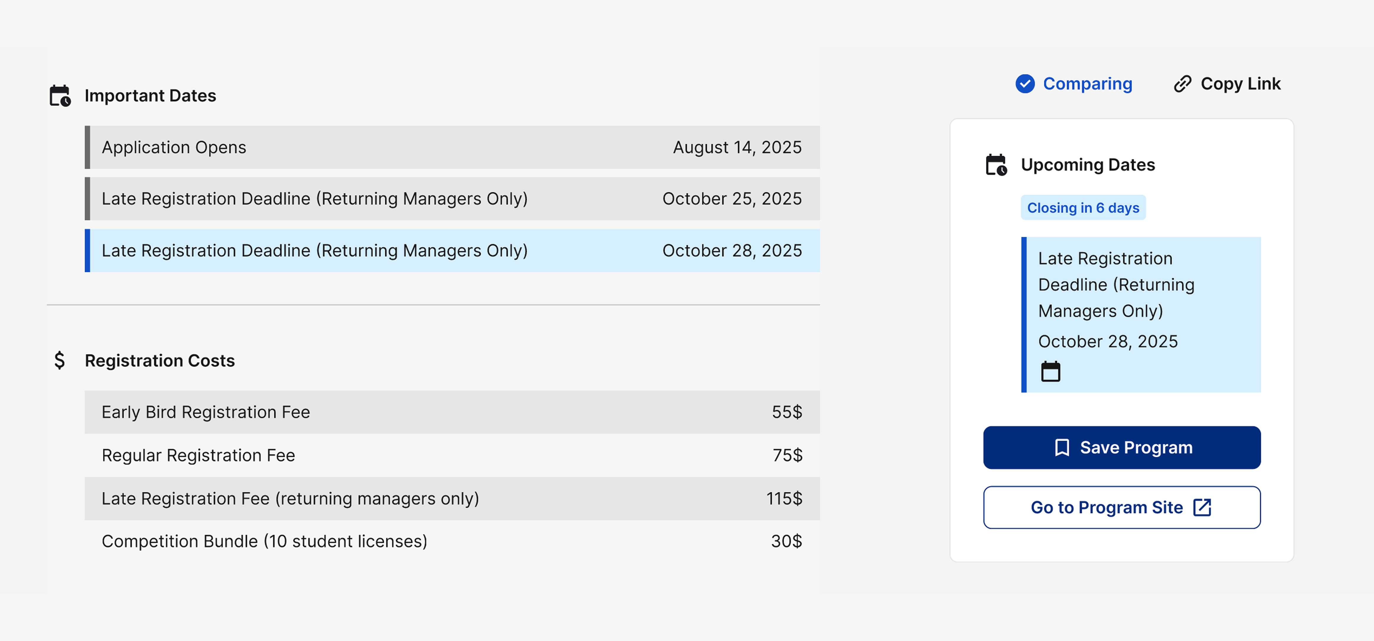
Presenting listed information legibly and functionally
Comparison
A landing page that showcases relevant data first

Mobile Compatability