Case Study 2
Competitions Pages
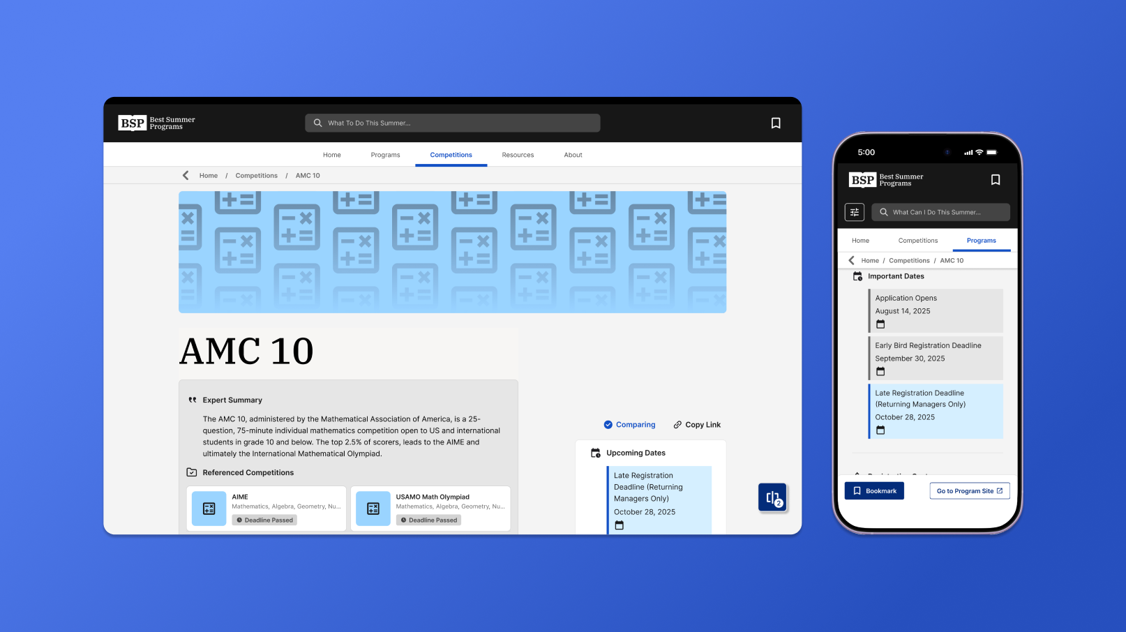
A new page template designed to keep variable competitions data glanceable.
Problem
Data was too long and inconsistent
Fields like deadlines and costs often had multiple values or conditions for competitions, creating inconsistent patterns across pages and lengthening our page scroll time.
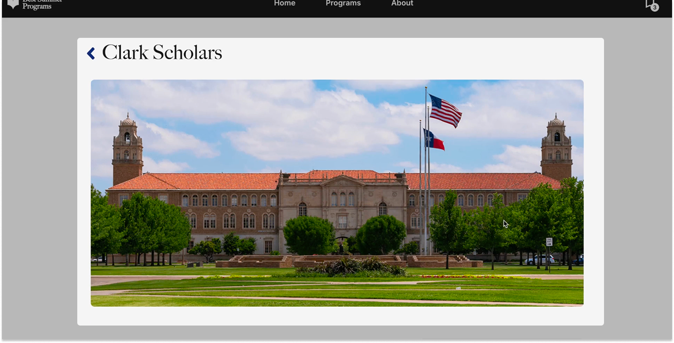
Initial landing page showed no information on first glance (Not my design)
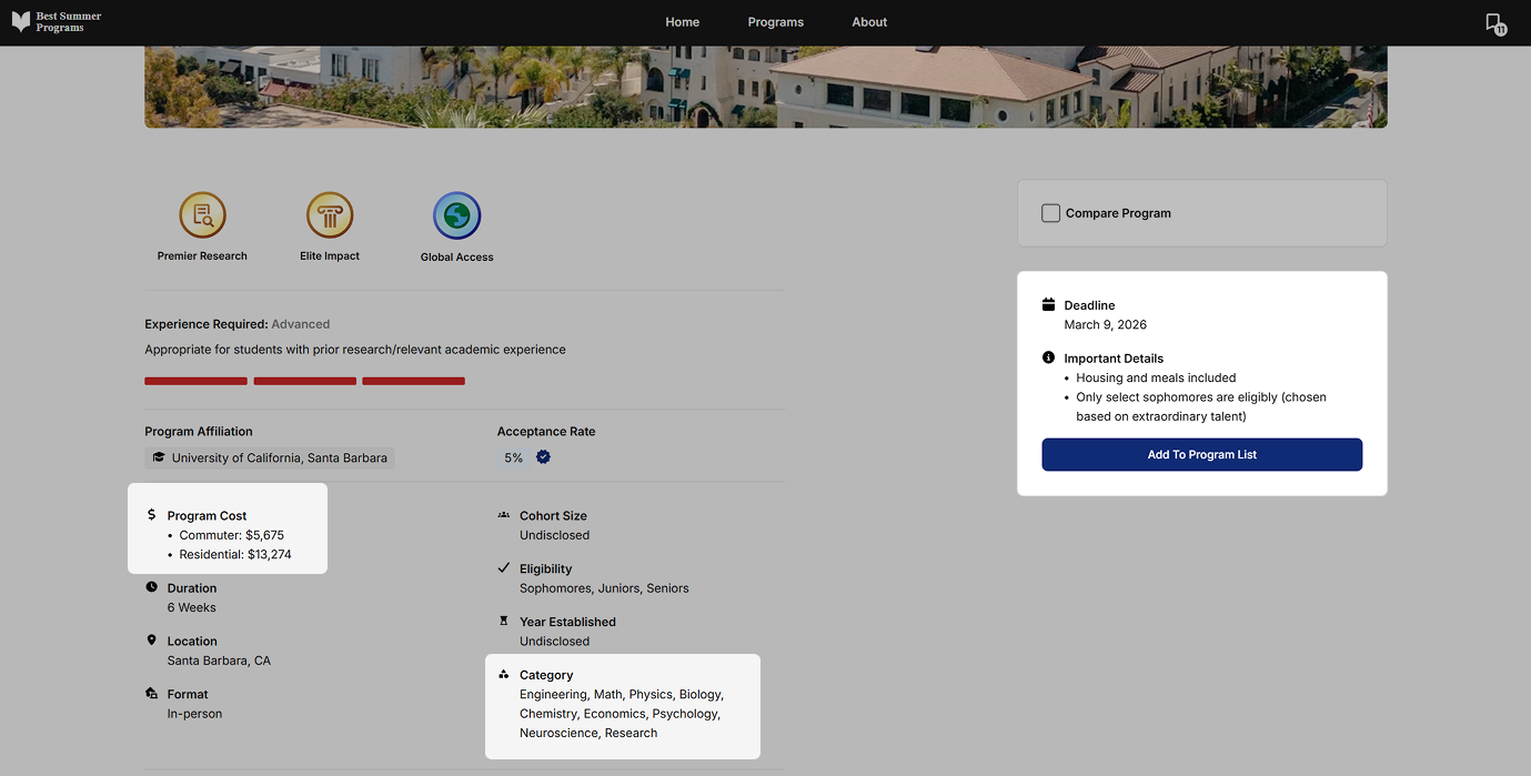
Project categories had inconsistent data formats (Not my design)
Design Goal
Clearer information hierarchy for pages
Redesigned page layouts to surface the most relevant information first, with new components built to handle variable data like tuition and deadlines, metadata, and summaries.
UX Design
New UX flow designed to improve glanceability
Restructured page layout based on user decision patterns, surfacing critical metadata like dates, disciplines, and experience over long-form descriptions.
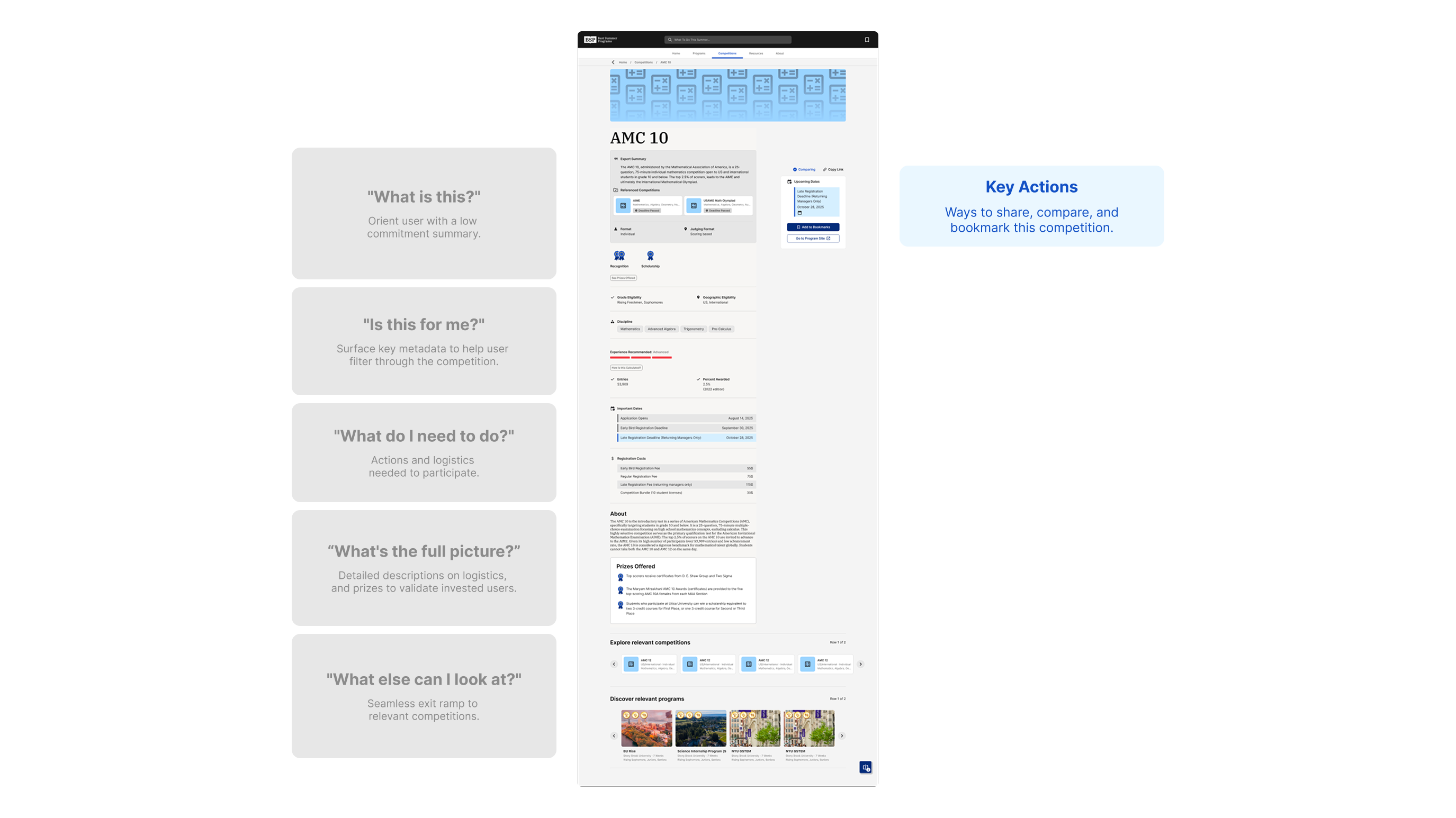
Shortened banner and surfaced/emphasized key info.
Landing Page
A landing page that showcases relevant data first
Reduced the banner height and pulled the title closer to the page content, making room for a new "Expert Overview" card — a component built to surface counselor-written summaries on what the competition is and why it matters.
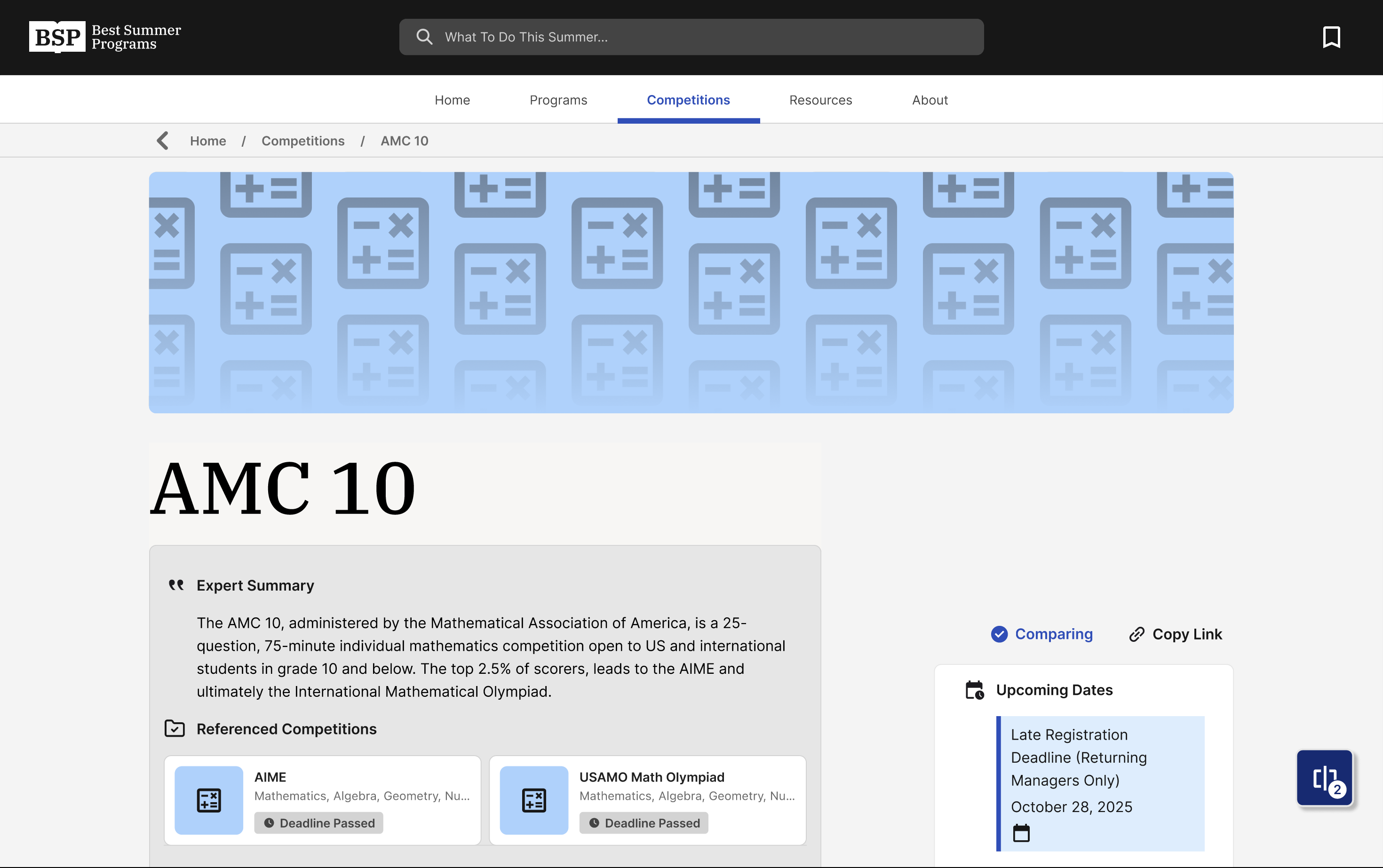
Shortened banner and surfaced/emphasized key info.
Displaying Lists
Presenting deadlines and fees functionally
These lists are designed around the content type, showcasing deadlines chronologically and color-assigned based on urgency, and multiple fees in a way for quick calculations.
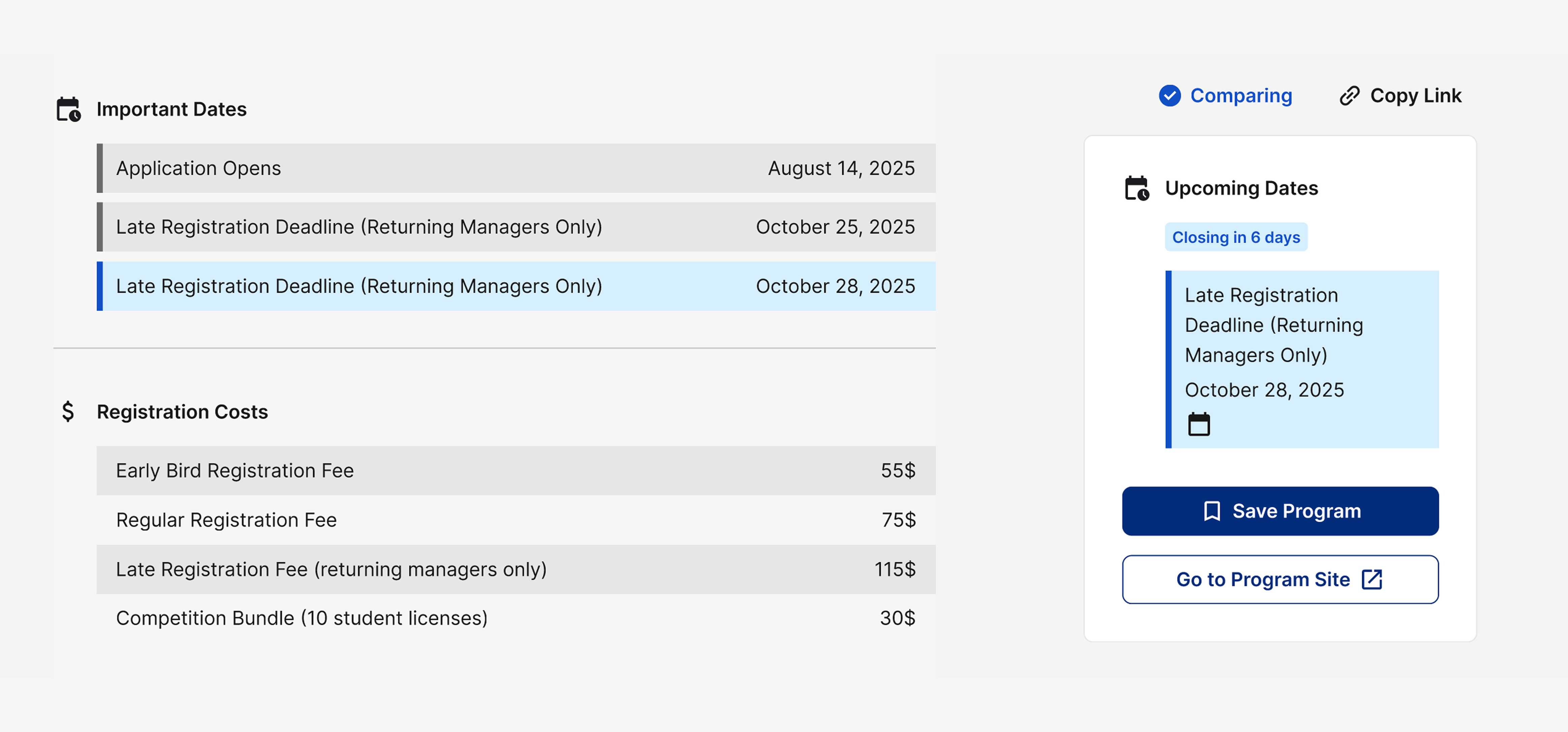
Presenting listed information legibly and functionally
Design System
New components built for variable data and legibility.
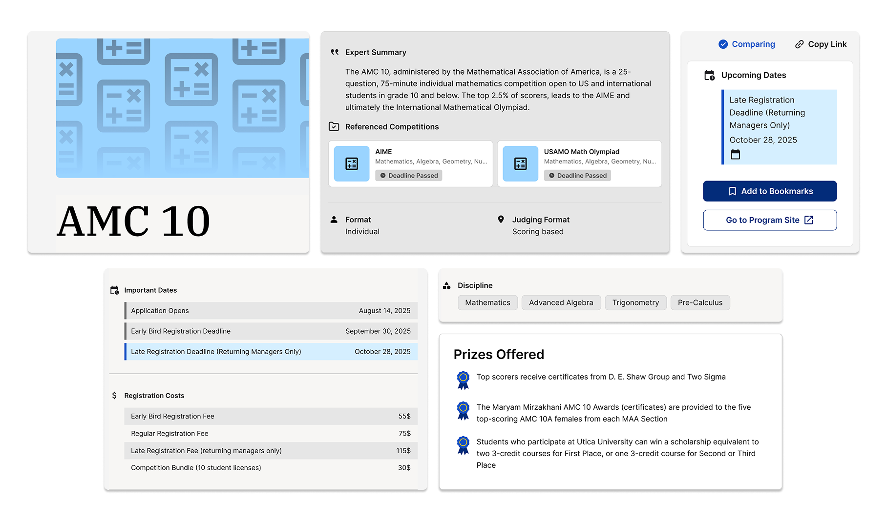
Mobile Compatibility