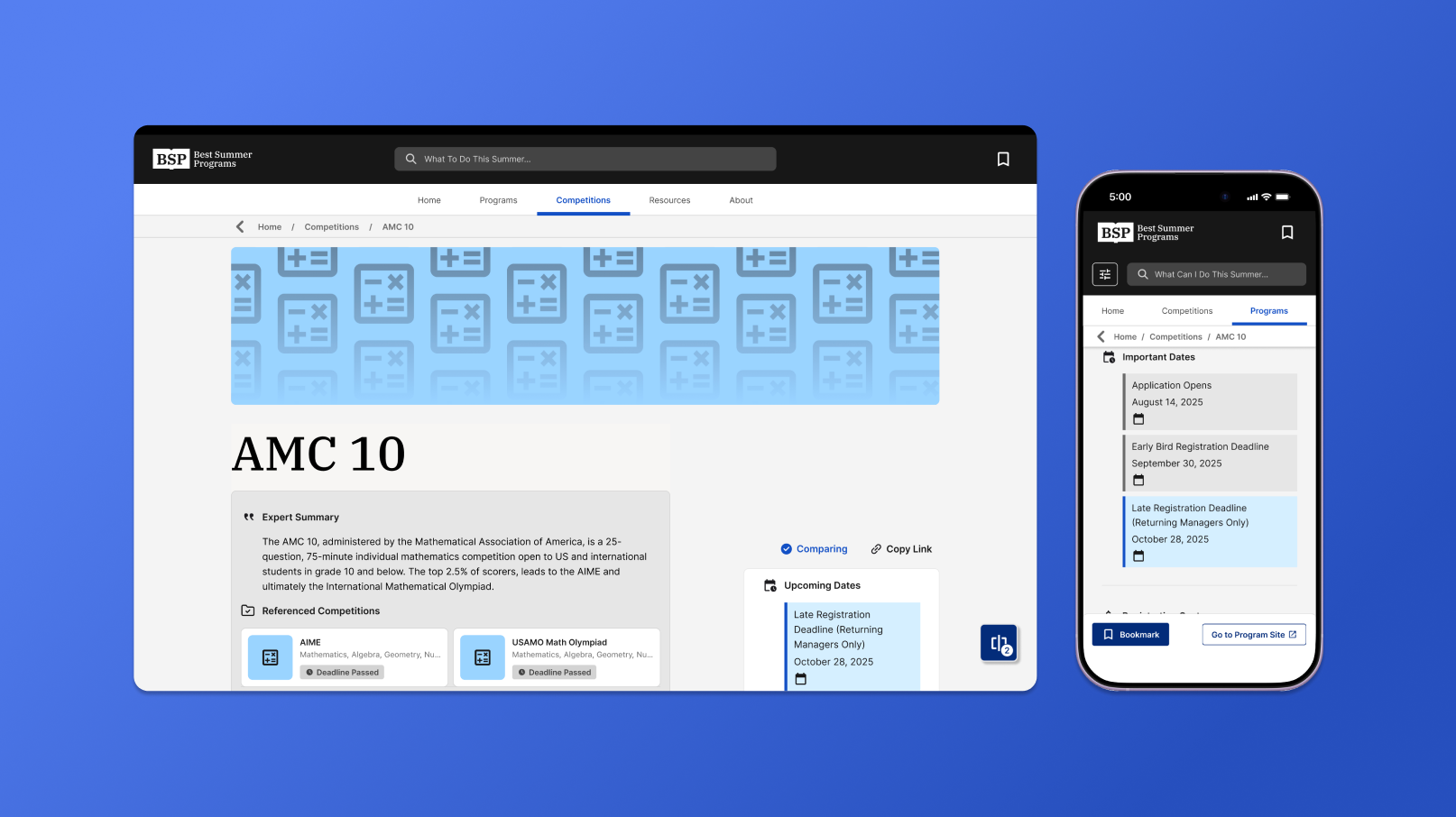
ContextOur team collected, and evaluated data on hundreds of high-school competitions, Problembut our current layout overcomplicated the information for our users.
Fields like deadlines and costs often had multiple values or conditions for competitions, creating inconsistent patterns across pages and lengthening our page scroll time.
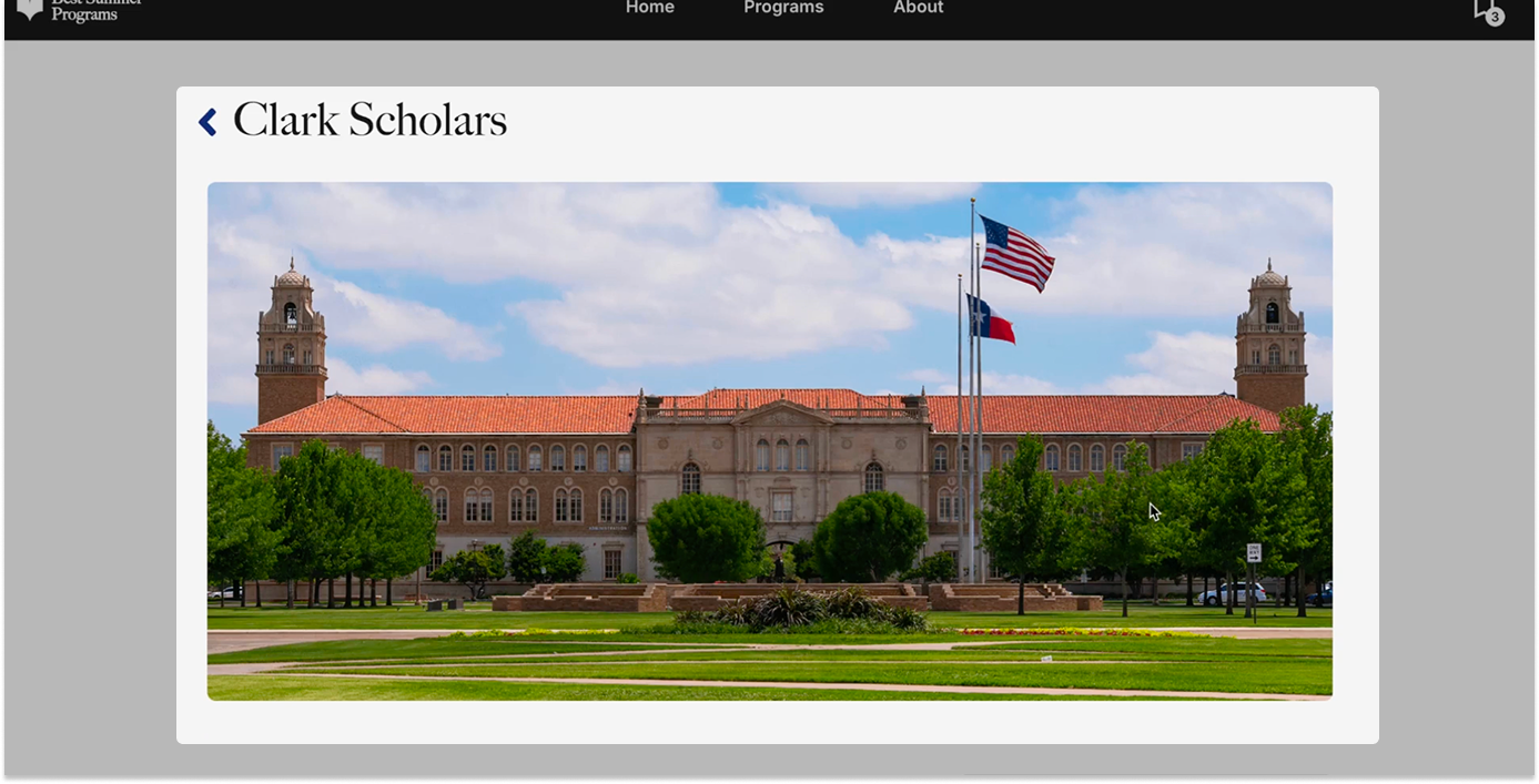
Landing lacked information
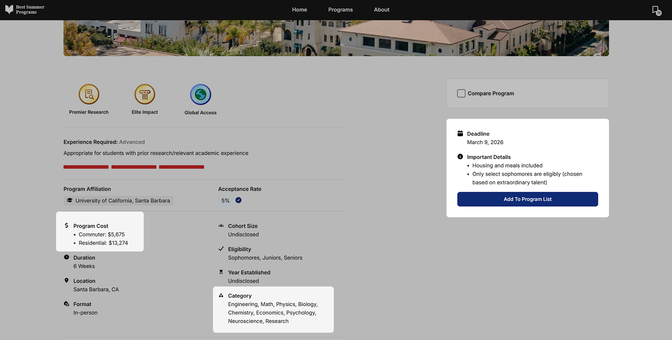
Data fields lacked hierarchy
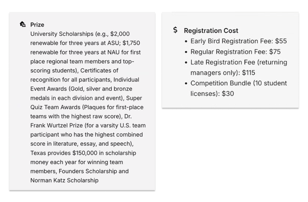
Large lists overloaded our components
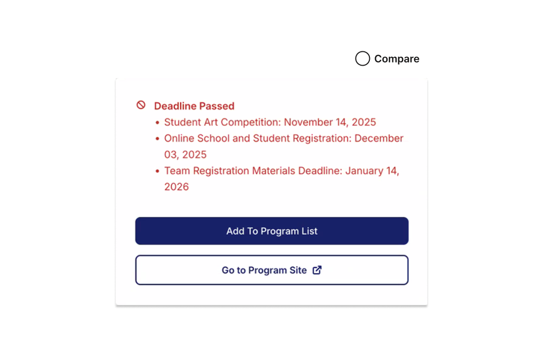
Unnecessary urgency for our users
InsightsStudents, parents, and counselors each valued functionality, legibility, and transparency. Design GoalSo we redesigned a system to support those values.
SolutionA new page format and component system that makes our competition data more glanceable.
Untangling our complex data through functional design patterns.
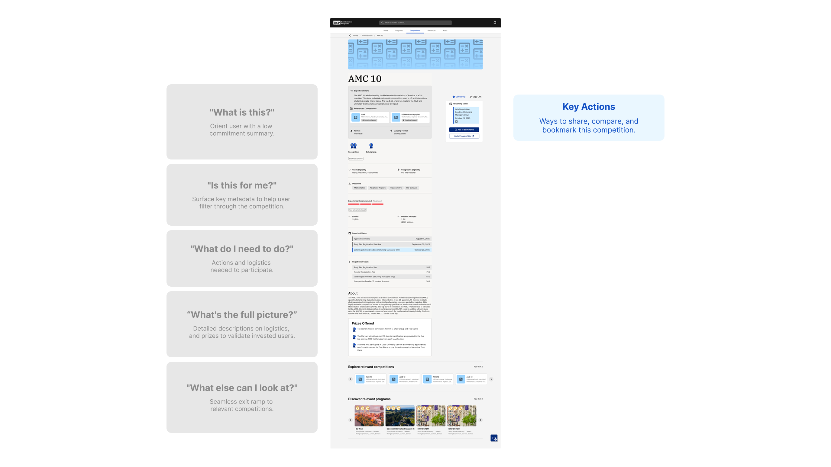
1/4Introducing our users to relevant information, transitioning from critical metadata to long-form descriptions.
Shortened banner and surfaced/emphasized key info.
2/4Upon landing, users are met with our expert anlayses through an overview card.
To prevent our counselor-written summaries from being skipped, I displayed them through an overview card format as an easier entry point.
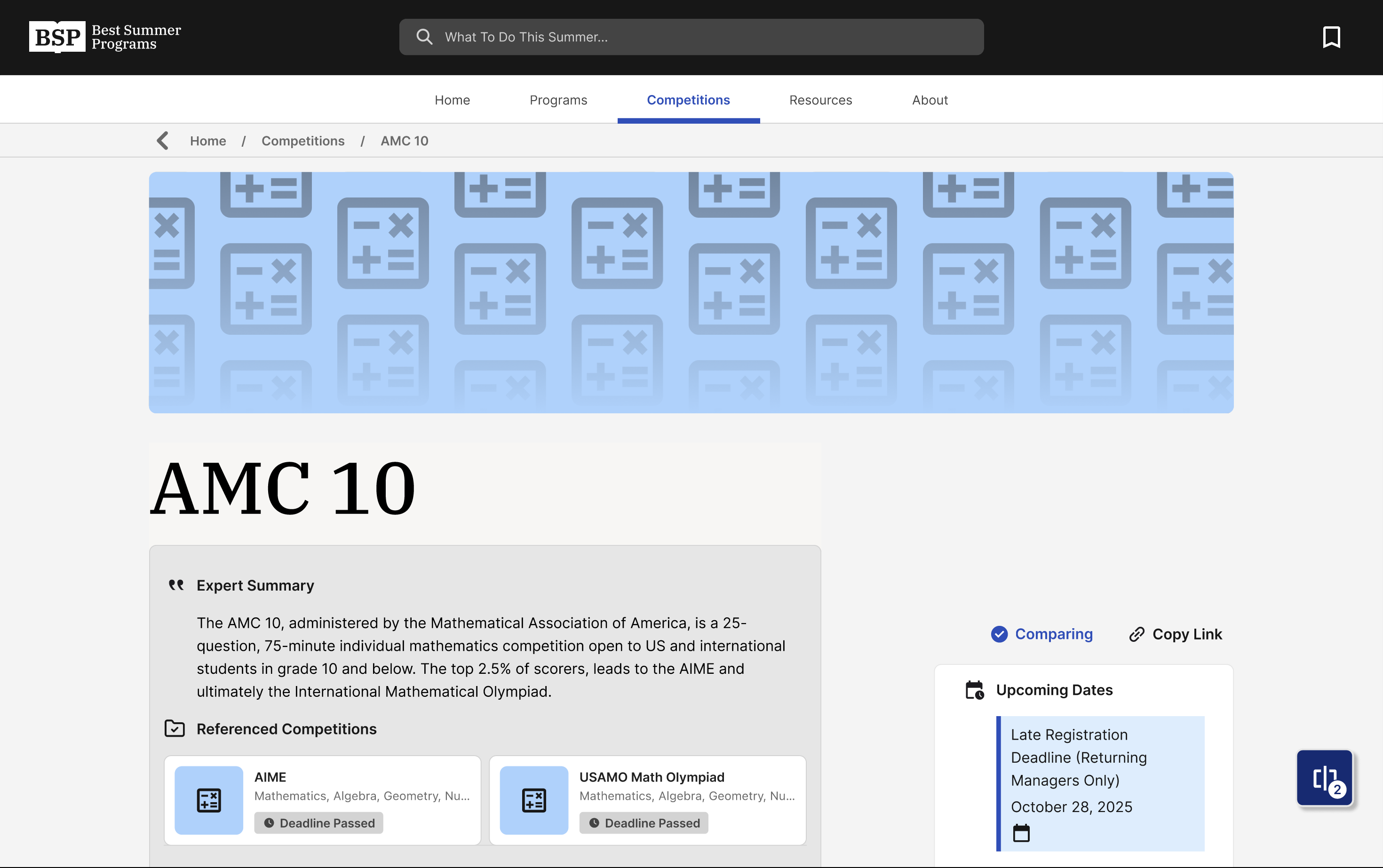
Shortened banner and surfaced/emphasized key info.
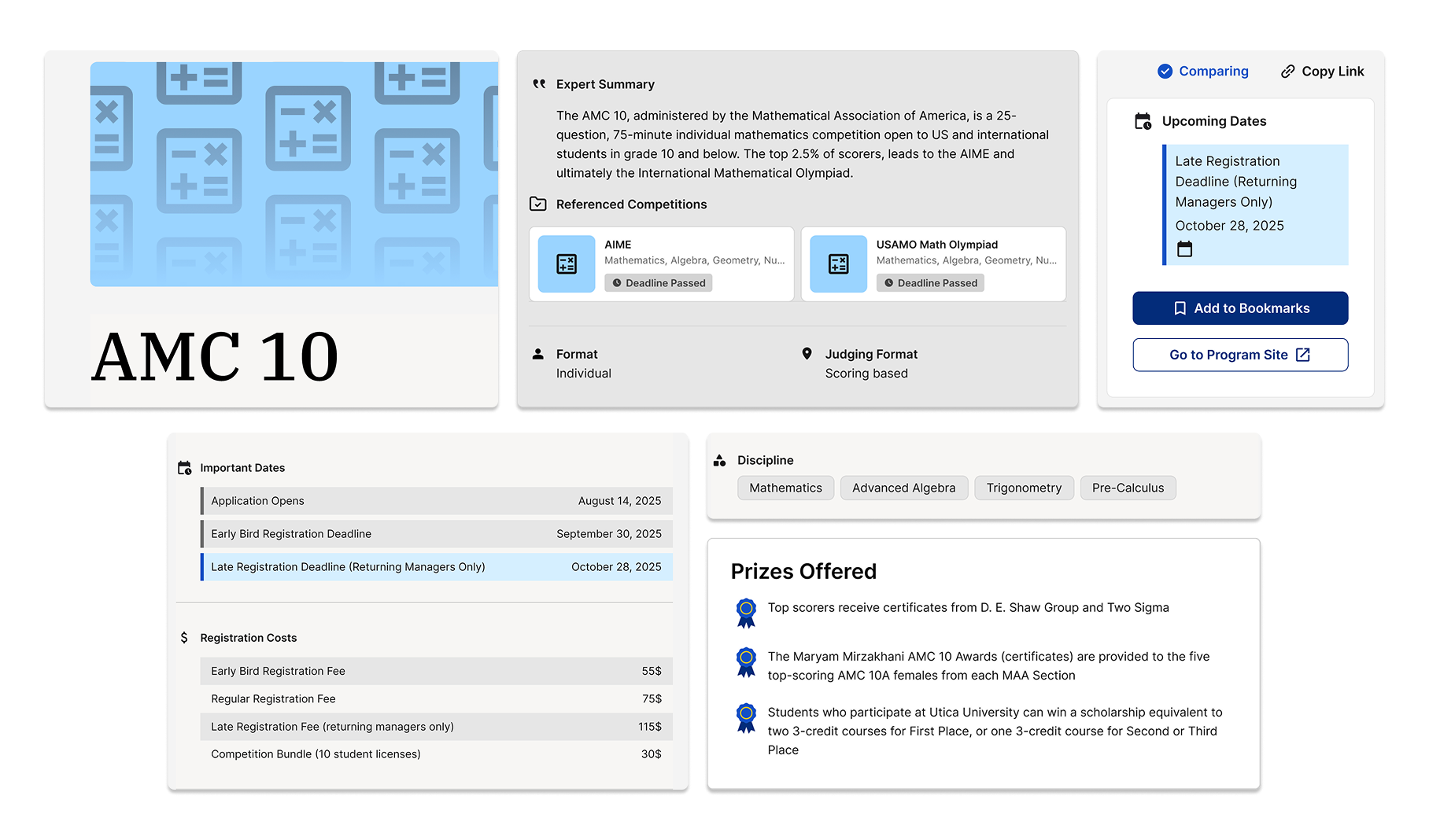
3/4Prizes, deadlines, and fees are presented functionally for users to quickly scan, plan, and calculate.
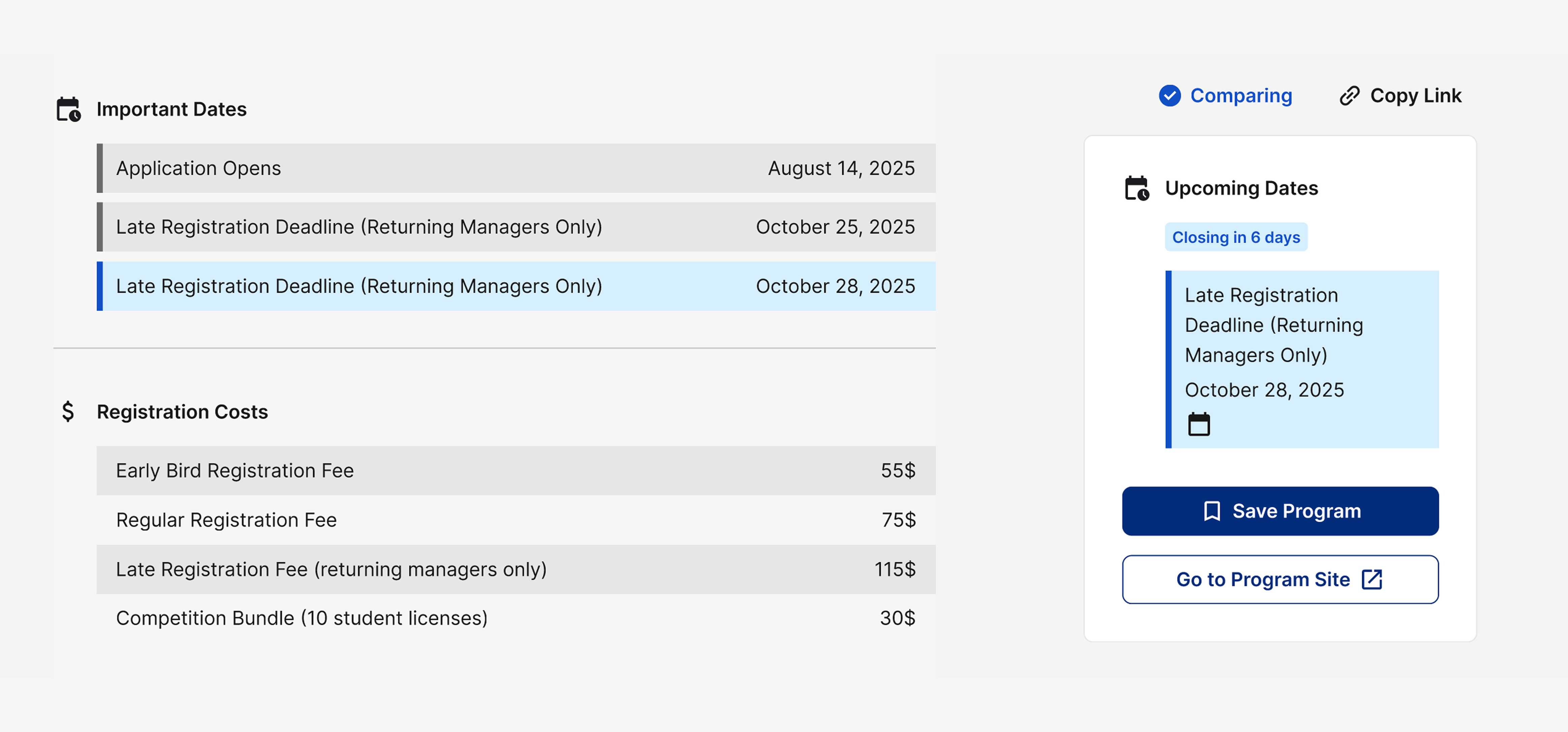
Presenting listed information legibly and functionally
4/4Categorizing prizes by types to help users assess the value of each competition.

MobileUsers are unblocked by information dense sections through compact modals, easily reaching all points of the page.
TakeawayDesigning for our users meant choosing and advocating for the right data in the backend.
This process involved communicating with our data team to shape our database intentionally, and avoiding overloading our users with irrelevant information.