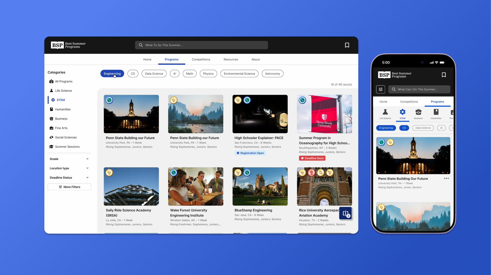
Context Our database grew from 50 to 500+ programs, and added a new 175+ competitions database to the platform, Problem however, our users weren't aware of how to access the new content.
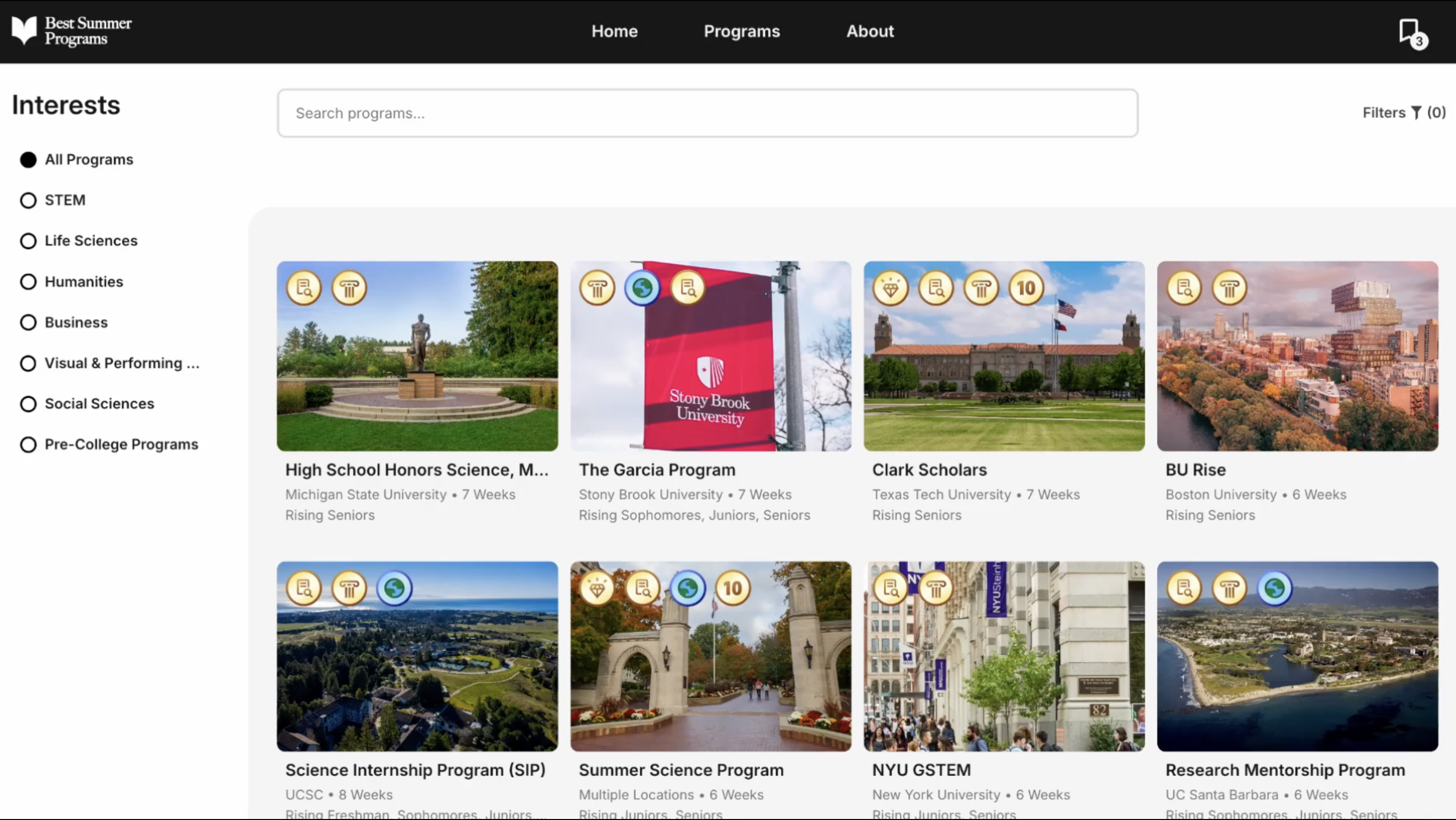
Previous MVP was built just for 50 programs
Insight Our users were unaware of the new content and features, Design Goal so we needed to create a more intuitive navigation experience.
Solution A redesigned filtering and navigation system.
Desktop navigation usage (search hover, subject pick, category pick, more filters)
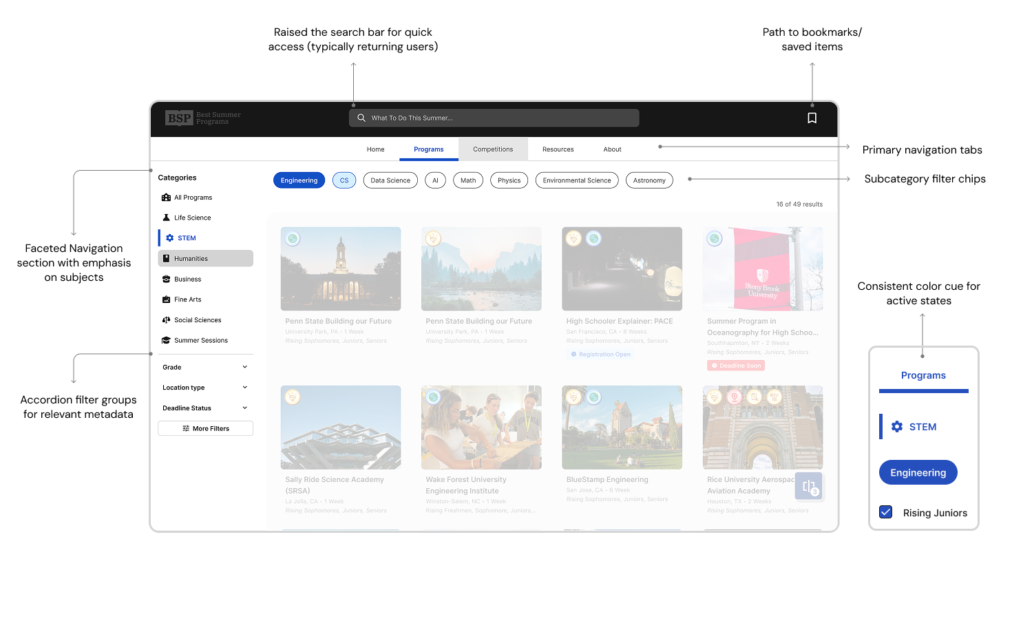
Desktop navigation usage (search hover, subject pick, category pick, more filters)
Mobile navigation usage (Menu expand, subject pick, category pick, more filters)
Mobile navigation usage (Menu expand, subject pick, category pick, more filters)
Filter modal
More to come...